Features of the Content Styler (advanced)
The Content Styler v2 includes several features that improve the visual appeal and functionality of Blackboard learning sites. A comprehensive list of these features is included in the following article. This article is targeted at advanced users who wish to learn more about the capabilities of the Content Styler. For a more basic explanation of the key features, see Introduction to the Content Styler.
Watch the following video for examples of the main content styler features in action.
Video Library
A full playlist of videos that covers all the Content Styler features can be accessed from: The Unit Content Styler 2.0 playlist
Readability
Readability is improved by setting a maximum page width, using larger fonts, and formatting items closer to modern website standards. Main headings are coloured blue, making them easier to identify. Brighter colours can be used to highlight important content. Images, videos and HTML tables can resize to fit better on mobile or desktop screens. These changes improve readability which aids student retention of information and better supports panning and scanning module content.
Content Editor text formatting
The content styler automatically styles text content that uses has been formatted by the Blackboard Content Editor using paragraph, Heading, Subheading 1, Subheading 2 and blockquote. The table below illustrates the different results.
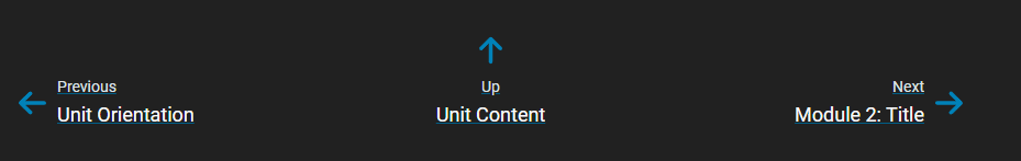
Navigation
Buttons are included at the bottom of each module page to make it easier for students the navigate through modules.
Improved printing
Module pages can now be printed from the browser with Blackboard menus removed. Changes to page scaling made in the browser's Print Preview dialog box now apply to the printed page. Students can print module content as they wish.
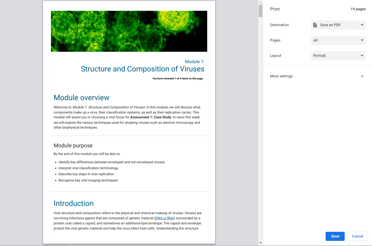
Note about printing interactive content
Videos, H5P activities, and embedded content will print with blank placeholders as this content is not static.
Improved device support
Significant improvements have been made to improve the experience of the styler on various devices, including mobile devices and PCs. The content styler will automatically adjust for different screen sizes and viewports ensuring that videos, images and text dynamically resize to suit the device automatically. HTML tables will also dynamically resize and scroll now (unless a set pixel width is applied).
Adding H5Ps using the plus button
H5Ps added to a unit module using the Plus + button are not dynamically resized. You can instead use the H5P embed option (not tracked), or add the H5P as a link. It is possible to use HTML to make a H5P added using the plus button responsive, but that is outside the scope of this guide.
Automatic content styling
The Content Styler changes the formatting of content items created using the Unit Content area of a Blackboard learning site. These Blackboard Items are created using the Build Content menu.
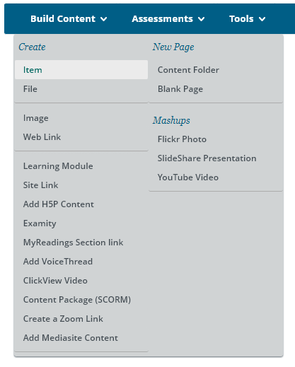
By default, the Content Styler will format text and headings automatically, resize and embed Clickview, Mediasite and YouTube videos, and turn web and site links into clickable buttons. The following table illustrates the way the Content Styler will automatically format learning site content once activated.
| Build Content Type | Formatting Support | Content Styler Result |
|---|---|---|
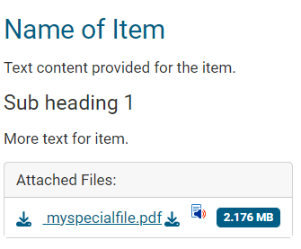
| Item | Yes. Text content that uses paragraph, Heading, Subheading 1, Subheading 2 and blockquote are automatically styled. Formats attached files with file size and download link. Formats YouTube links and content added using the + plus button. Note: changing text font size, color or pasting formatted text will override the styler. |
|
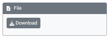
| File | Yes and includes a download button. It is recommended to add files to a Blackboard Item instead, so that a file description and file size will be displayed. |
|
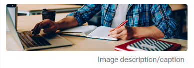
| Image | Yes with captions applied. Name the image 'top-banner' to use as a banner at the top of the Blackboard page. |
|
| ClickView Video | Yes and the video is playable. |
|
| Add Mediasite Content | Yes and the video is playable. |
|
| Content Folder | Yes. Creates a card that can include a banner image with a caption and View button. |
|
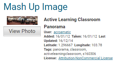
| Mashups | The mashup can be partially styled. It is recommended to use the + plus button in the Blackboard Content Editor instead, as the result is easier to read. |
|
Content Types that only format as links
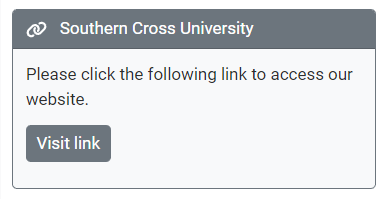
Content that uses Blackboard's LTI can only be styled in a link box with a Visit Link button, since the content opens in a new window or new location where the content styler doesn't load. The following content types can only be styled as a link to the content: Web Link, Site Link, Add H5P Content, Add Voicethread, Content Package (SCORM), and Create a Zoom Link.
Some of these content types can be added to a Blackboard Item using the + Plus button in the Blackboard content editor instead.
Avoid these content types!
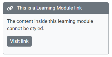
It is advised to avoid using Learning Module and Blank page since the styler provides better navigation and functionality, which supersedes these Blackboard content types. In addition, any content placed inside these content types cannot be styled.
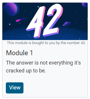
Module Cards
Content folders can be formatted into 'cards' that identify individual modules. Cards can include images with captions, a clickable View button to access the module, and a title and description to summarise the content or topic.
Create Module banners
The following video walks through the process: The Unit Content Styler 2.0 - Adding a Banner
Activity boxes
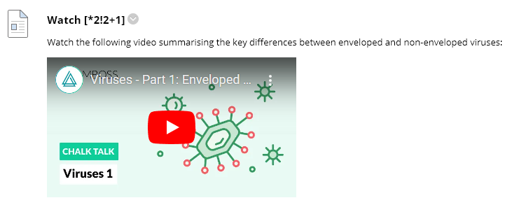
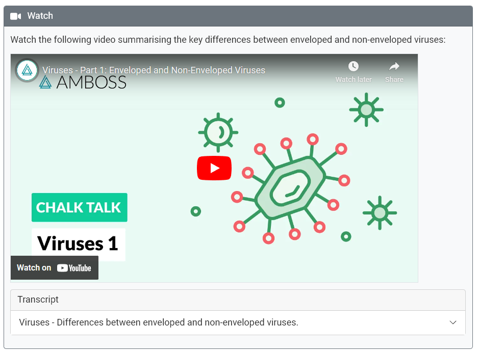
Learning activities can be formatted inside a grey box to stand out from other content (requires wildcard *). Activities can include a visually appropriate icon: Reading, Video, Reflect, Question, Comment, Case Study, Checkpoint (requires a number 1-7 placed after the *).
Create Activities
The following video walks through the process: The Unit Content Styler 2.0 - Making an Activity
Accordions and Tabs
Text and other content can be grouped into accordion boxes that expand when clicked (requires wildcard ^). Multiple accordions can be opened all at once or independently (requires wildcard ^^). Tabs are similar to accordions but are listed vertically rather than horizontally.
Use Accordions and Tabs with caution
Accordions and Tabs hide content from students. Be mindful that students may miss important content where it is located within an accordion.
Create Accordions and Tabs
The following video walks through the process: The Unit Content Styler 2.0 - Accordions and Tabs
Notes and Wells
Notes and wells can be used to highlight and draw attention to important information using coloured boxes.
Create Notes and Wells
The following video walks through the process: The Unit Content Styler 2.0 - Notes and Wells
Spacing items
The amount of blank space can be adjusted between items to improve the page layout (requires wildcard ! and a number 1-9 ).
Remove Item Heading
Main item headings can be hidden where required, e.g. where content and activities are located in within a larger section (requires wildcard _ ).
Add Space and Remove Headings
The following video walks through the process: The Unit Content Styler 2.0 - Adding Space and Removing Headings
Groups
Items can be joined together into one larger item with a single heading (requires wildcard + followed by the number of items to group). This is useful because you may want an activity box to include a video and an accordion.
Some items can't be grouped together
Please note that some items are incompatible with each other and can't be grouped in a particular order (e.g. wells and notes can't be grouped into an accordion). You also can't use multiple icons in one grouped item, the styler will default to the last defined icon.
Don't group a group!
Make sure that you don't try and group items together that are also already in a group. This will result in odd content styler results.
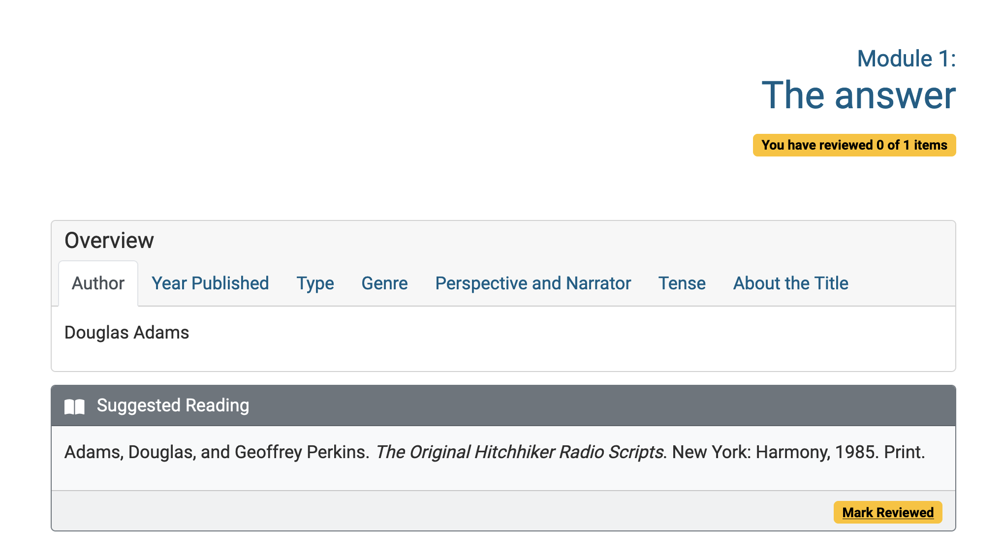
Progress bar
Tracking student progress can be added to modules by turning on the Blackboard "Mark reviewed" setting on content items. Students clicking the "Mark Reviewed" button under content items can indicate they have finished that item. Academics can then run Blackboard reports on which students have marked items reviewed.
Improved support for video streaming services
The content styler will automatically resize videos so that they appear consistent across any device. YouTube or Vimeo links pasted into the Blackboard content editor will be dynamically resized automatically. It is best practice to use these streaming services for video, such as MyMediasite (use Build Content > My Mediasite Content to add the video).
Finding videos uploaded to Blackboard directly
The content styler will detect the use of videos added directly to the Content Collection. You can use the Highlight Videos button the help identify these videos when Edit Mode is OFF.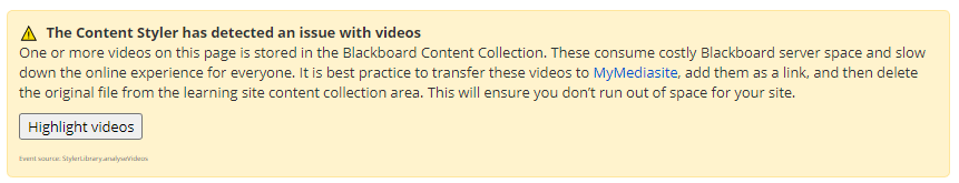
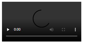
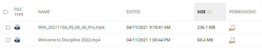
These videos can be identified when Edit Mode is ON by looking for the Blackboard video player (below), or found in the site content collection area (note the video icon and .mp4 file extension in the example below).
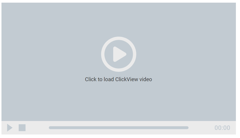
- Clickview links added through the Build Content> Clickview video menu will be automatically playable on the page when the styler is active.

- Mediasite links added through the Build Content> Add Mediasite Content menu can be loaded on the page when the styler is activated. Videos that require authentication will add a loader screen automatically.
- YouTube links pasted into the content editor are resized dynamically.
Further information about the Content Styler
Please see the following articles to learn more about how the Content Styler functions, what wildcards can do and steps to troubleshoot issues with the content styler.
- Features of the Content Styler (advanced)
- Create an activity box using wildcards
- Content Styler Cheatsheet
- Troubleshooting the Content Styler v2