Checking accessibility
Follow these simple practices to make your subject site and learning materials clear and accessible for all students:
- Structure your content clearly using subheadings and consistent formatting. Use inbuilt styles and content stylers, bulleted and numbered lists.
- Use clear and concise language, explain new discipline-specific terms and include instructions to students in plain English.
- Add captions and/or transcripts to video and audio content.
- Add alternative text to images by asking “what is the purpose of this content”? Images of text need to provide a text alternative.
- Ensure that H5Ps are accessible or provide an accessible alternative. H5P recommendations on accessibility: https://documentation.h5p.com/content/1290410474004879128
- Be mindful of how you use colour – ensure there’s enough contrast between text and background, it’s not overwhelming and colour alone is not used to convey meaning.
- Provide link text that is descriptive so that the link destination makes sense out of context.
- Ensure that tables have a caption and have header rows/columns.
- Use the Blackboard Accessibility Checker when building your Blackboard site.
Accessibility checklist
Unit Code:
Module # | Yes/No | Comments |
Content is structured clearly using subheadings and consistent formatting and uses Blackboard’s inbuilt styles and SCU content stylers. | ||
Uses clear and concise language, explains new discipline-specific terms and includes instructions to students in plain English. | ||
Captions and/or transcripts to video and audio content are present. | ||
Documents uploaded to site (e.g. Word, pdf) are accessible | ||
Alternative text is added to images. Images of text have a text alternative. | ||
H5Ps are accessible or provide an accessible alternative. | ||
There’s enough contrast between text and background, it’s not overwhelming and colour is not used to convey meaning alone. | ||
Linked text is descriptive, so that the link destination makes sense out of context, and for downloads, file type and size is included after the link. | ||
Tables are not used for formatting. |
How to check your site for accessibility
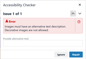
Blackboard’s Accessibility Checker
Use the Accessibility Checker in Blackboard content items. Best to check as you build.
The Accessibility Checker will check that:
- images have alternate text
- headings are used correctly rather than formatting font and use sequential heading levels
- tables are compliant, e.g. have a caption and have header rows/columns
- lists use bullets/numbered lists.
Work your way through the issues identified. You can often fix issues from within the Accessibility Checker.
Check colour contrast
Contrast and colour use are vital to accessibility. Users, including users with visual disabilities, must be able to perceive content on the page.
Colour contrast ratio requirements apply to text and graphics that are essential for understanding the content or functionality. You don’t need to meet colour contrast requirements for logos or incidental graphic elements.
Colour Contrast Analyser
TPGi’s free colour contrast checker tool allows you to easily determine the contrast ratio of two colours simply using an eyedrop tool.
Download the application from: https://www.tpgi.com/color-contrast-checker/
See how to use it: https://youtu.be/AZTJQ6uopA8
How to check Microsoft files accessibility
You should perform this check before “pdf’ing” documents to ensure accessibility of a pdf.
You can check accessibility for Word, Excel, PowerPoint documents and Outlook emails:

